Biscuit
Making unfamiliar journeys feel a little more familiar.
Biscuit is a navigation experience that combines mobile and AR guidance to reduce the uncertainty and cognitive load of navigating unfamiliar journeys.
Role
Product / Interaction Designer
Team
4 UX Designer
Timeline
3 weeks
My contribution
Extended independently from a group project. All UI screens, prototypes, and AR system designs are original individual work.
Overview
BloomingPods is a speculative transit system that introduces autonomous feeder shuttles (pods) that pick students up from neighborhood streets and connect them to the city bus network.
To support this system, I designed an AR-based virtual assistant that consolidates scattered transit cues such as bus tracking, route confirmation, and stop awareness into a contextual spatial interface.
Instead of repeatedly checking apps or scanning the environment, students receive ambient guidance and real-time updates only when relevant. The result is a context-aware commuting experience that reduces cognitive load while preserving user control during everyday transit.
PROBLEM SPACE
IU students juggle 3+ apps
just to catch a bus and still miss it.
IU students juggle multiple bus apps, watch digital "stop requested" boards, and crane their necks to read unfamiliar streets — all while mentally managing class schedules and deadlines. When buses disappear from apps, arrive full without warning, or stop unexpectedly, the fragmented information landscape turns a routine commute into a stressful task.
We designed Biscuit, an AR-powered companion that consolidates scattered transit cues into a single, ambient spatial interface. Information surfaces only when relevant. The rest of the time, the system stays out of your way.
"When in a rush, checking SPOT (bus tracking app) actually slows me down."
— IU Graduate Student, Research Interview
RESEARCH & DISCOVERY
Finding the moments
where uncertainty becomes stress.
Our research goal was specific: to identify where and why uncertainty occurs during IU students' bus journeys, and locate the moments of cognitive stress most addressable through context-aware AR support. We combined field observation and interviews with bodystorming, a method that revealed interaction problems invisible on a 2D canvas.
01 — Field Observation
Rode IU buses across multiple trips. Observed micro-behaviors: how riders look for seats, confirm stops, and judge whether their pace will get them there on time.
02 — Interviews
Deep dives with IU students on commute pain points, trust levels with automated systems, and notification tolerance under academic stress.
03 — Bodystorming
We physically simulated the bus journey using paper prototypes and uncovered a key issue: a centered navigation bar would block passengers’ faces in crowded conditions.
FROM RESEARCH TO DESIGN
Every insight has a design decision.
Students weren't confused about routes, they were overwhelmed by scattered reliability cues. Each finding below drove a specific design response.
"Graduate students want to commute with their brain off.

Designed an ambient color-state system (translucent / blue / green) that communicates status without requiring reading — no text until the user taps.
Students couldn't see empty seats in the back of a crowded bus.
Floating AR markers identify vacant seats, even those hidden from boarding-line sightlines, and mark the correct pod on the curb.
Buses disappear from real-time tracking apps without explanation.
A persistent progress bar in the bottom-right corner with a one-tap delay reason and rerouting option which never silently disappearing.
Cold winters intensify pressure to time departures perfectly.
Pace-maker AR footprints guide walking speed so students leave at exactly the right moment, no mental calculation required.
Bodystorming: centered navigation overlays passengers' faces on a crowded bus.
Navigation bar repositioned to bottom-right corner.
Setting Biscuit up around you.
THE SOLUTION
Biscuit's mobile experience handles onboarding and personalization before the journey begins. Students choose which services to connect, control the notifications they receive, and decide how much access Biscuit has to their data.

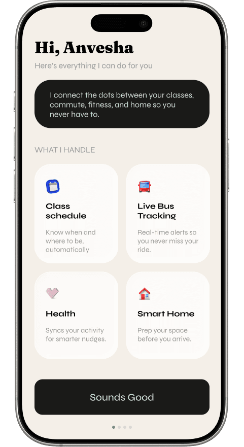


Personalized
Connect schedule, transit and activity data.
Opt-in
Every integration is controlled by the user.
Adjustable
Students choose how and when Biscuit gets their attention.
AR SYSTEM DESIGN
Information in the periphery. Clarity on demand.
The AR layer is organized around two principles:
Progressive disclosure - shows detail only when requested & Ambient status - uses color as language
The virtual assistant is a customizable AR cat and is an embodied guide that is present when helpful and invisible when not.
Pace-maker footprints
AR footprints adjust to help students reach their pickup point on time—removing the need to constantly calculate whether they're walking too fast or too slowly.
Floating identifiers
Spatial markers identify available seats and the correct pod even when they're outside the traveler's immediate line of sight.
Progressive status
A persistent status bar communicates journey progress at a glance. When something changes, students can expand it for the reason, updated ETA, and available options.
What I learned
Bodystorming reveals what wireframes miss
Acting out the journey exposed spatial problems that weren't visible on a 2D canvas—including a navigation overlay that would obscure passengers' faces. It reinforced the importance of designing spatial interfaces in the environments they'll actually occupy.
Automate routine, not judgment
Biscuit handles repetitive tasks like timing, transfers, and pace guidance while leaving consequential decisions—such as rerouting or canceling a journey—with the traveler.
LIMITATION & NEXT STEPS
Privacy architecture
Privacy is one of the major concerns since our virtual assistant is collecting personal data from Canvas, calendars, and location tracking. We require some better controls and options so users know exactly what's being collected, from where its being collected and can opt out whenever required.
Real-world reliability
Real-time data integration with traffic and weather apps requires APIs that might not always be reliable or accurate.
Edge-case journeys
Our design doesn’t tackle what happens when pods or buses are full and in those cases users need to be rerouted. And finally we focused mainly on regular scheduled trips but haven't explored how the system would work for spontaneous out-of-schedule trips where there's no pattern data for the VA to learn from.
Early usability testing
Testing the interaction, not proving the behavior
We used the BJ Fogg Behavior Model before ideation to focus our concepts around two things we could influence: ability and prompts.
Rather than asking employees to build an entirely new sustainability habit, Clover intervenes at moments when a lower-impact choice is already easy to make.
We conducted two formative usability sessions to understand whether Clover's core interaction was clear: Could employees notice a nudge without feeling interrupted? Could they understand why a recommendation appeared? And could they confidently decide what to do next?
With a small sample, our goal wasn't to validate long-term behavior change. It was to identify early usability issues and refine how Clover communicated its recommendations.
Reflection
WHAT I TOOK AWAY
Small interactions can create impact at enterprise scale
Clover changed how I think about behavior change. Sustainable action doesn't always require asking people to radically change their habits. Sometimes the bigger opportunity is a small intervention, placed at exactly the right moment in an existing workflow.
What feels like a minor decision for one employee can become significant when repeated across an organization. This project made me more conscious of the responsibility we have as designers: not just to make actions possible, but to make better choices easier to make.
Clover was created by a six-person team as a Salesforce-sponsored project, with ongoing critique and feedback from Salesforce product designers.
Next up: